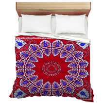
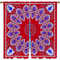
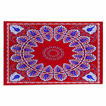
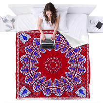
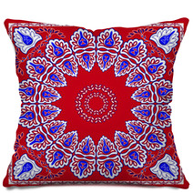
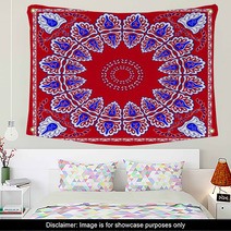
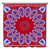
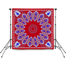
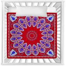
Choose From A Wide Array Of Red White And Blue Home Decor Goods
The Classic Bandana Head Scarf Design pattern is on hand in a wide selection of home decor goods from murals, to comforters, to rugs and window curtains, and even toddler comforters or shower curtains.Style Your Entire Rooms Decor
Entire Red White And Blue themed collections are available for your bedroom, bathroom and almost any room in your house. How about a plush new rug for your basement?Did You Know You Can Personalize This Design
Let us change the main color or any color within this design to ANY shade you like. VisionBedding can also add personalized text anywhere within the design. VisionBedding’s personalization options are almost infinite. Let us adjust the orientation or the main object within this specific Classic Bandana Head Scarf Design design.Embrace Your Pizazz with Red White And Blue Wall Decor
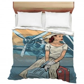
Do you recall that view when you first saw a room and how thrilling and a little wild it was to stand in the big blank space? You might have started envisioning your flatscreen, your coffee table, your sectional, and chairs. Sometimes, it’s hard to envision your walls as open space. You might think your room feels stuffed already with other decor. However, there is plenty of a space for Classic Bandana Head Scarf Design wall art.
The trick to wall art is not just knowing what to hang, but the method to hang it. Your wall art should be a continuation of your space without overdoing it. When hanging wall art, consider your space. Art doesn’t have to be centered in a room, but rather, installed around current decor. For example, a big piece should be hung right above a large piece of furniture, such as your entertainment center or sofa. Also, wall art needs to be hung so that the center of the wall art hits at eye-level for the average person. Does your current decor restrict that? It might be a better option to find a new space to install your art. Too Small & Too Gloomy
If you are dealing with a little area, be sure your more prominent tone is not too heavy. Picking a principal dark tone for a little area is a big mistake! Somber hues can instantly make rooms seem cramped because they restrict sunlight from hitting the walls. Softer hues will permit natural light to flow through the area, thereby creating a more inviting space. Heavier hues do the opposite, as they soak up natural light, stopping it from filling the area. “And when design is completed, it should seem natural and obvious. It should look like it is always been this way. And it should last.” Roger Black